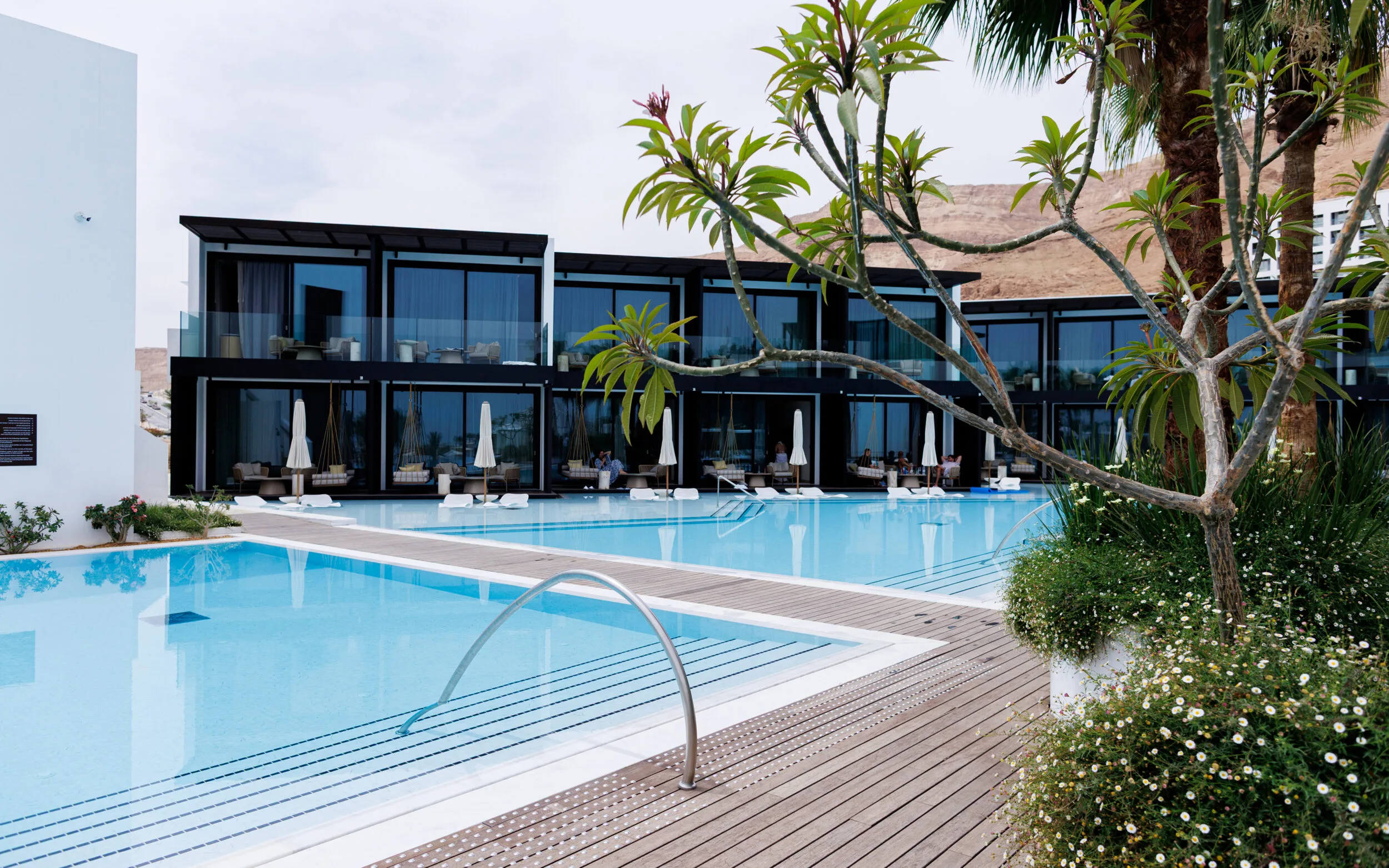
For the hotel, we created an identity rooted in the extraordinary landscape of the Dead Sea. Turquoise was selected as Kayma’s signature color — a direct reference to the shifting tones of the water, set against the restrained black framework of Isrotel Exclusive.
The visual language looks closer at the landscape itself. The unusual salt formations of the Dead Sea — salt mushrooms, crystalline surfaces and naturally accumulated layers — became the inspiration for a series of textures that accompany the identity across its different applications.
The result is a visual world that belongs to the Isrotel system, yet could only belong to Kayma.


The signage system was designed as a natural extension of Kayma’s visual identity and its desert surroundings. Corten steel was selected for its material presence and its durability in the demanding climate of the Dead Sea.
The wayfinding system guides guests across the hotel’s two levels, including clear orientation toward the guest rooms located on the upper floor. The hotel’s main exterior sign was designed with day-and-night illumination, allowing the identity to remain visible and distinctive from daylight into evening.